Overview
User Experience Design
Content Strategy
Visual design
My Role
UX/UI Designer
I created Wiredframe,Mockup,Prototype
Visual Designer
I created Graphic element, Icons
Client
DigitalReach
The client wants a website design that emphasizes credibility but is simple and not too tense, as it will display a large amount of information.
/Challenge
The client has no budget for research because they are a non-profit organization. The data provided by the client is complex and extensive, making it challenging to display. The CI color is red, which makes the display somewhat uncomfortable. Additionally, the provided information is not categorized, which might lead to user confusion when selecting what to view.
/Solutions
Start by controlling the use of red color, applying it only to buttons and highlights in certain areas. Focus on using white and dark gray to make it easier for users to read. Design illustrations in an infographic style to keep the appearance less serious while still conveying comprehensive and engaging meanings. Additionally, address research issues by interviewing 2-5 volunteers using a prototype and incorporating their feedback for improvements.
Systems


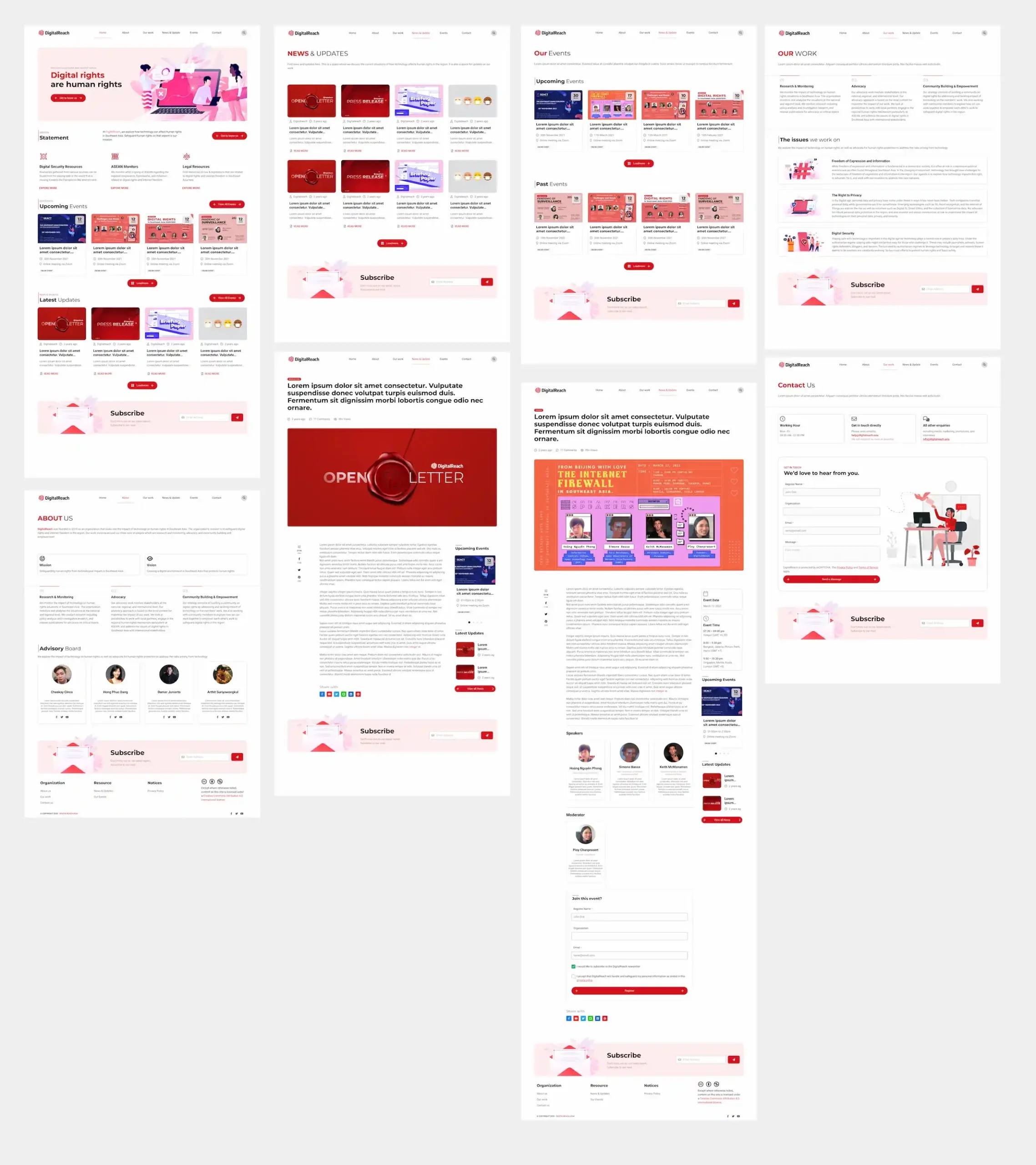
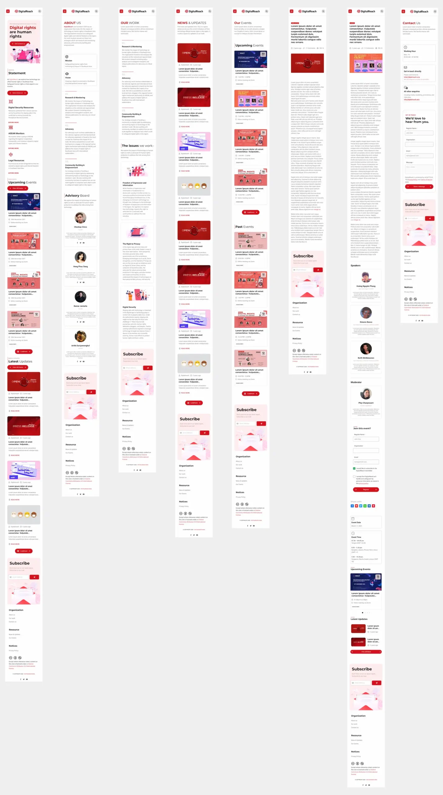
Design
🖥️ Desktop
📱Mobile
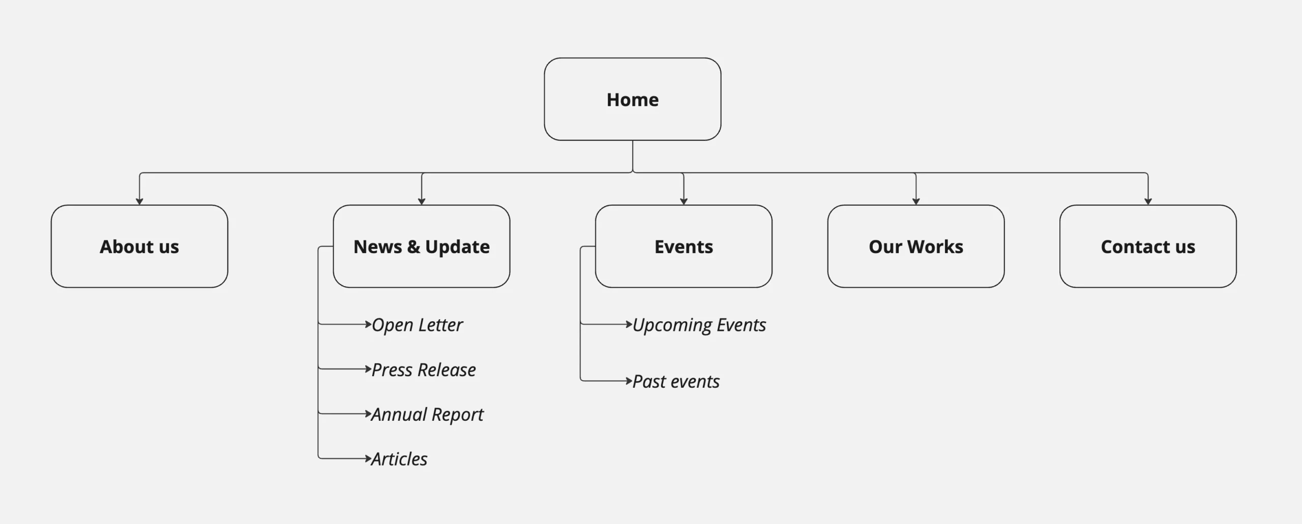
Sitemaps