Overview
Role:
UX/UI Desiginer
Developer
Client
Chevita Healthcare Co.,Ltd.
Background
Chevita or Chevita Healthcare is an international healthcare company dedicated to providing effective and reliable healthcare solutions for individuals and families worldwide while also caring for and prioritizing environmental sustainability.
Problem Statement
Consumers need accurate, up-to-date health product information and want quick and easy access to new products. Currently, the company’s product information is scattered across various platforms like Lazada and Shopee, making it difficult to search through the vast amount of data. This leads to a lack of consumer confidence in making immediate purchase decisions on these platforms.
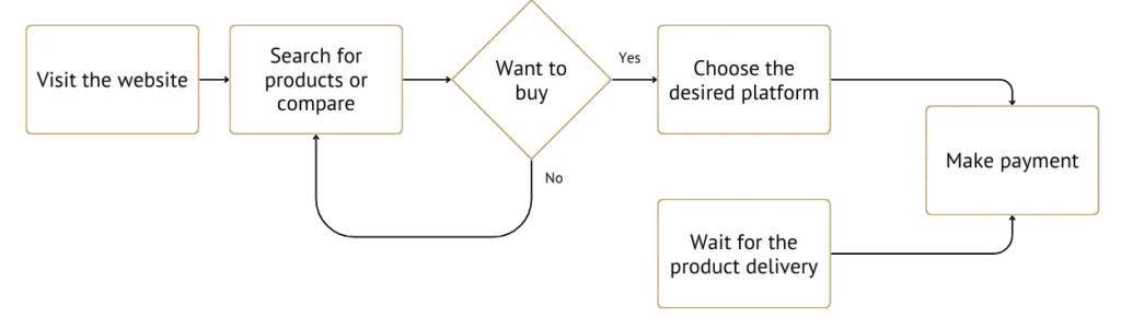
User Journey mapping
| Stage | Awareness | Consideration | Decision |
| 👨🏻💻 Task List | 🔹 Saw promotional posts on Facebook / Twitter / LinkedIn 🔹 Searched for ‘Product Name’ on Google 🔹 Searched for ‘Health Products’ on Platforms: Lazada and Shopee | 🔹 Visit the product detail page 🔹 Check the price and promotions 🔹 Compare the price and features | 🔹 Click the “Lazada” or “Shopee” button on the website to proceed with the purchase 🔹 Receive additional promotions and discounts from the platform 🔹 Wait for the product delivery |
| 💬 Feeling | 🤔 Interested but unsure 📌 Want to know more details” | 🤓 More interested 🏷️ Find similar products more easily 🏷️ Want to compare different products | 🛒 Convenient, fast, connected to familiar platforms 💕 Happy, value for money, cost-effective ⏳ Expecting, excited, looking forward |
| ❌ Pain Points | 🔻 Product information on social media is limited and difficult to compare 🔻 Too many similar products, hard to tell which one is genuine or fake 🔻 The website loads slowly | 🔻 Unfamiliarity with the website layout 🔻 Products with the same features but different packages, causing confusion 🔻 Unclear product categories, unsure where to compare | 🔻 Complicated payment process 🔻 No convenient contact options for inquiries 🔻 Uncertainty about the product quality 🔻 Concerns about delivery |
| Opportunities / Improvements ✅ | ✅ Improve SEO for easier searchability ✅ Add an easy-to-understand product menu and a search bar for immediate keyword input ✅ Optimize code and image size to speed up page loading | ✅ Adjust the layout to resemble other platforms so users won’t worry about navigating between pages ✅ Organize product categories using symbols or images for easy differentiation ✅ Separate products with different packages and provide clear descriptions | ✅ Create articles explaining payment methods and warranty terms ✅ Add multiple contact options on the website ✅ Include reviews from actual users ✅ Improve delivery options to meet platform standards |
User Flow
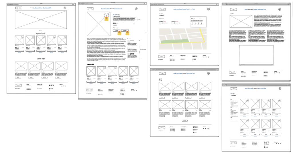
Low fidelity
High fidelity
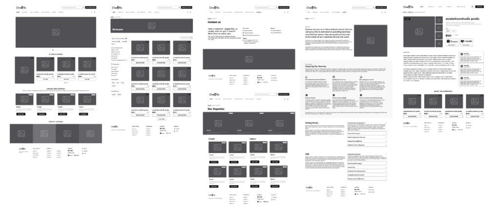
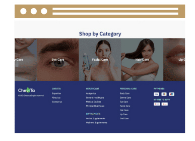
Shop by Category
Select to buy by category: Scroll to view all our products with images instead of descriptions.
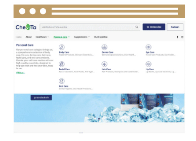
Mega menu with icon
Easily explore our products and services with a Mega menu featuring icons, helping you find what you need quickly and accurately.
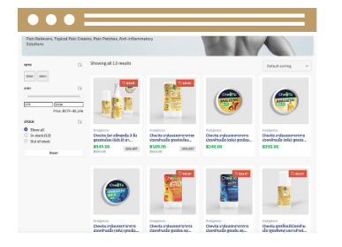
Shopping online layout
UI design that focuses on mimicking the layout of an
e-commerce website helps users feel seamless when switching between platforms.
Design
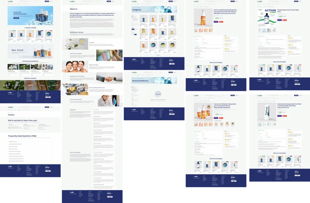
🖥️ Desktop
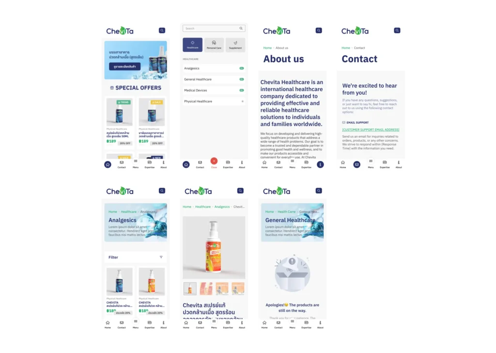
📱Mobile
Result
Based on the review of user data before and after the website design, the data will be referenced from October to December 2022, based solely on sales that occurred on the shopping platform.
| 🛒 Platform Engagement | Only Shopping Platform (Sales in Baht) | With Showroom Website (Sales in Baht) | % Improvement |
| Lazada | 500,000 | 562,500 | 12.5% |
| Shopee | 300,000 | 342,000 | 4% |