Overview
My Role
Visual Designer
Client
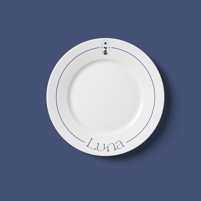
Luna Specialty Cafe
/Brief
Luna is a family-owned brand dedicated to designing for coffee and tea shops, built around the concept of exploration and savoring the artistry of beverages together. Beyond drinks, Luna also offers a selection of pastries and baked goods, creating a complete and delightful experience for customers.
/Insparation
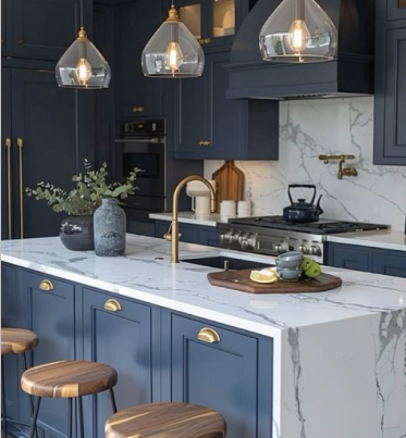
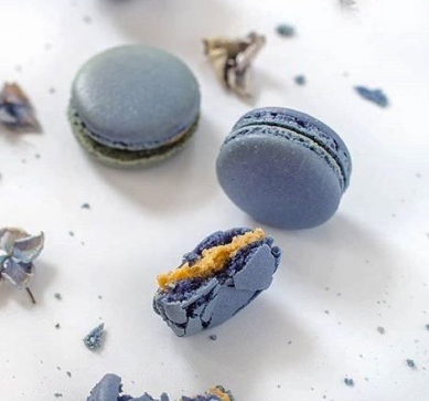
We want the logo to evoke a sense of softness, gentleness, and relaxation while still conveying determination and dedication. The design features a rabbit gazing at the moon, symbolizing romance, tranquility, ambition, and imagination. For the color palette, we have chosen a gray-blue with hints of purple to create a calm and dreamy atmosphere, complemented by golden yellow to add warmth and enthusiasm.
Primary Color

East Bay is a muted, calming shade of blue with subtle hints of gray, evoking a sense of tranquility and sophistication. This deep, serene hue brings to mind the peacefulness of the ocean or the sky at dusk. It conveys feelings of stability, balance, and reliability, making it a versatile color for both professional and creative applications. East Bay Blue is ideal for designs that aim to create a sense of calm, elegance, and understated luxury.
Feel: Calm, Sophisticated, Tranquil, Stable, Elegant, Subtle
Secondary Color
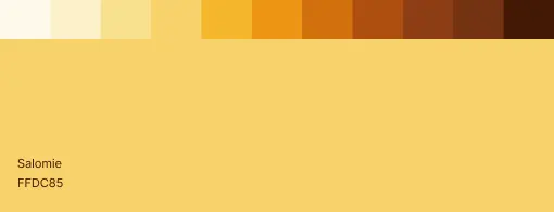
Salomie is a warm, soft shade of yellow that exudes a sense of optimism, energy, and positivity. This gentle hue radiates warmth and brightness, while maintaining a subtle and inviting tone. Often associated with happiness, creativity, and warmth, Salomie Yellow can bring a cheerful, uplifting atmosphere to any design. It’s perfect for creating an approachable and lively feel without overwhelming the senses.
Feel: Cheerful, Optimistic, Warm, Inviting, Uplifting, Creative