Overview
My Role
Visual Designer
Client
Asadang Nuttgijpreecha
/Brief
The original logo has a flat and outdated design. The client wants a more modern and dynamic look with a 3D effect, making it visually engaging. Additionally, the color scheme should reflect professionalism and be suitable for a B2B logistics business.
/Insparation
The design deconstructs elements from the original logo, featuring overlapping wing-like shapes to create a sense of depth. Darker shades are used in overlapping areas to enhance the 3D effect and dimensionality. The color palette has been refined to be more subdued and professional, with a clear distinction between primary and secondary colors for a balanced and cohesive look.
Before

After
Primary Color
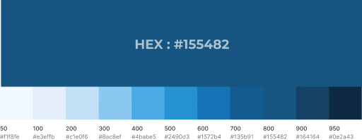
Chathams Blue is a shade of blue inspired by the Chatham Islands in the Pacific Ocean. This deep, tranquil hue evokes a sense of stability, trust, and professionalism. Often used in designs that aim to convey reliability, elegance, and formality, Chathams Blue enhances brand identity and interior aesthetics by adding a refined, modern, and sophisticated touch.
Feel: Calm, Trustworthy, Elegant, Professional, Refined, Modern, Sophisticated
Secondary Color
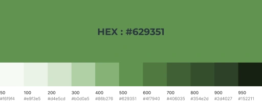
Fruit Salad Green is a vibrant and refreshing shade of green, reminiscent of the natural hues found in fresh fruits. This lively color conveys a sense of energy, freshness, and vitality, making it ideal for designs that emphasize health, sustainability, and a dynamic, modern aesthetic. Its bright yet balanced tone adds a playful yet professional touch to branding, interiors, and digital designs.
Feel: Fresh, Energetic, Playful, Rejuvenating, Inviting, Vibrant


